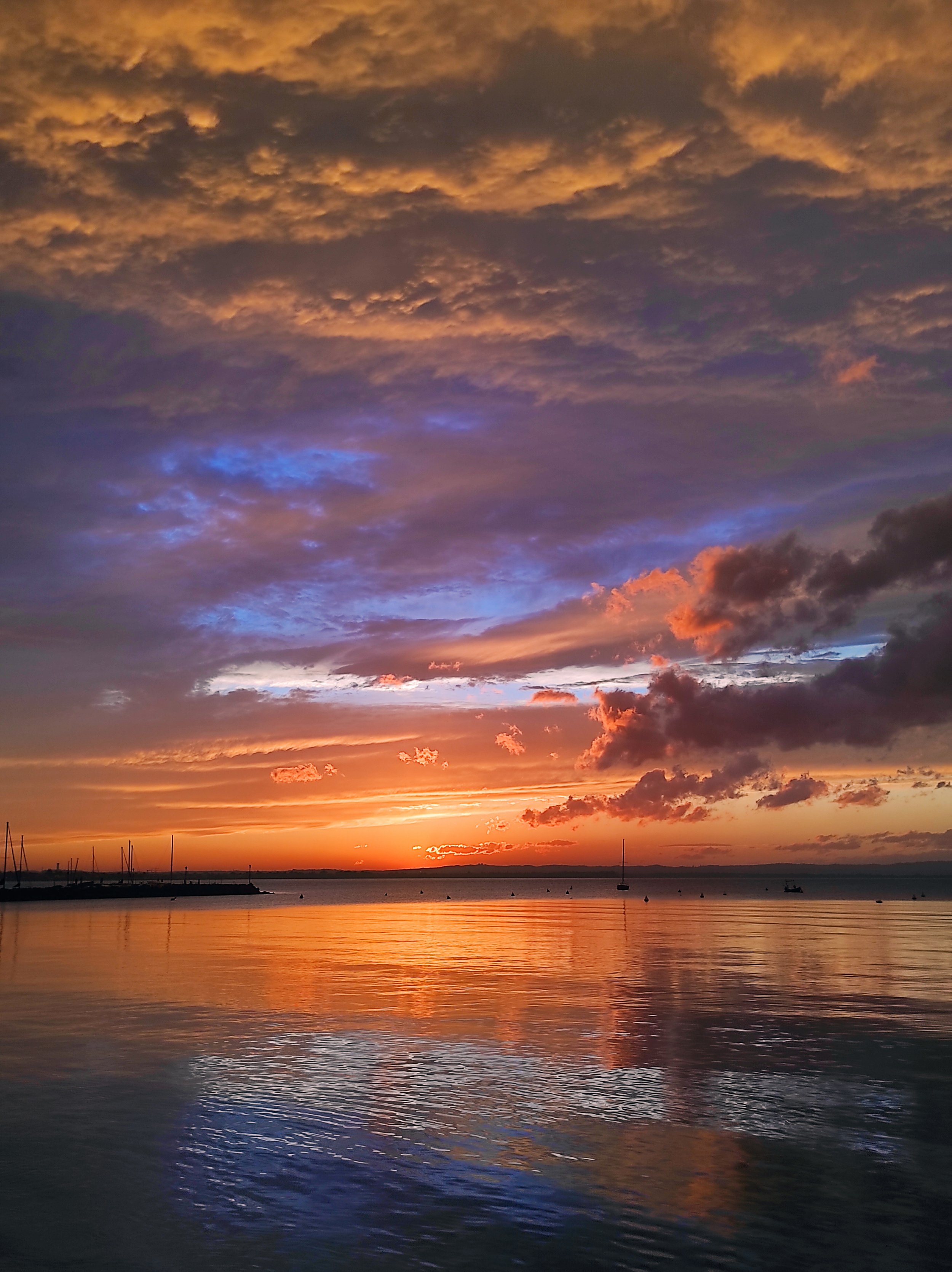
The temperatures are still pleasantly mild, the vineyards are dressed in beautiful autumn colours, and the entire region can be explored at a much slower pace than during the busy summer months. This is Lake Garda in autumn.
Many people think of Lake Garda as a summer destination. Here at Podere Selva Capuzza, however, we often encourage our guests to visit during autumn instead. It is the season when you can truly slow down, leave the crowds behind, and discover what makes this corner of northern Italy so special.
Discover the Region Through a Glass of Wine
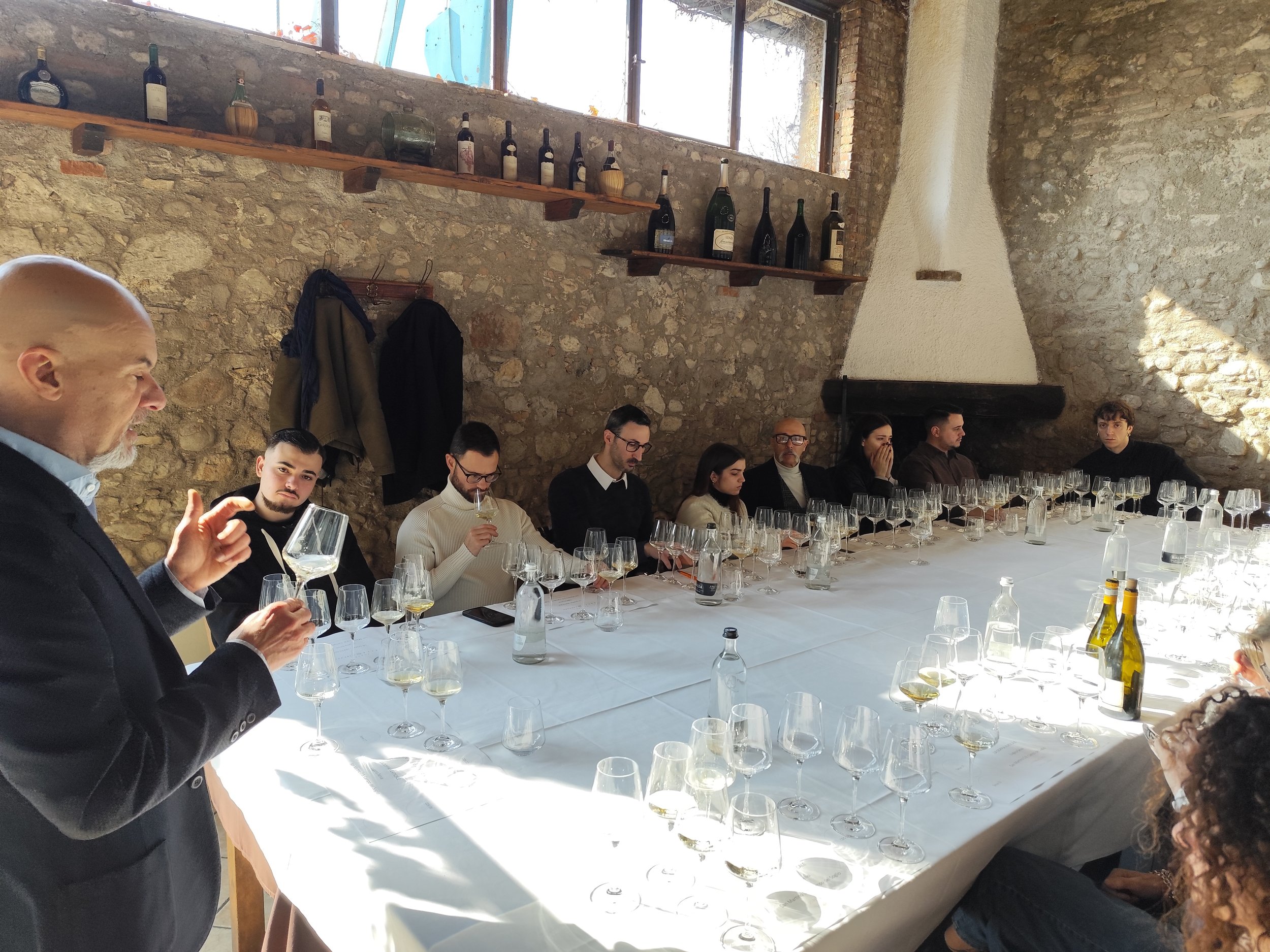
A visit to our winery is much more than a tour through vineyards and barrel cellars. We love sharing the story of these moraine hills, explaining why they produce such distinctive wines and what it means to make wine here, generation after generation.
Our wine tastings take place beneath the winery's portico, surrounded by vineyards and olive groves—an ideal setting to experience the landscape in every sip.
Autumn is also the season for Profumi di Mosto, one of the area's most anticipated wine events. This year's edition will take place on 4 October 2026. Advance booking is required, clicking here.
Many guests arrive already familiar with Lugana. During their visit, they also discover San Martino della Battaglia, Groppello, and the many stories behind these local wines—stories that rarely appear in travel guides.
Explore the Moraine Hills on Foot or by Bike
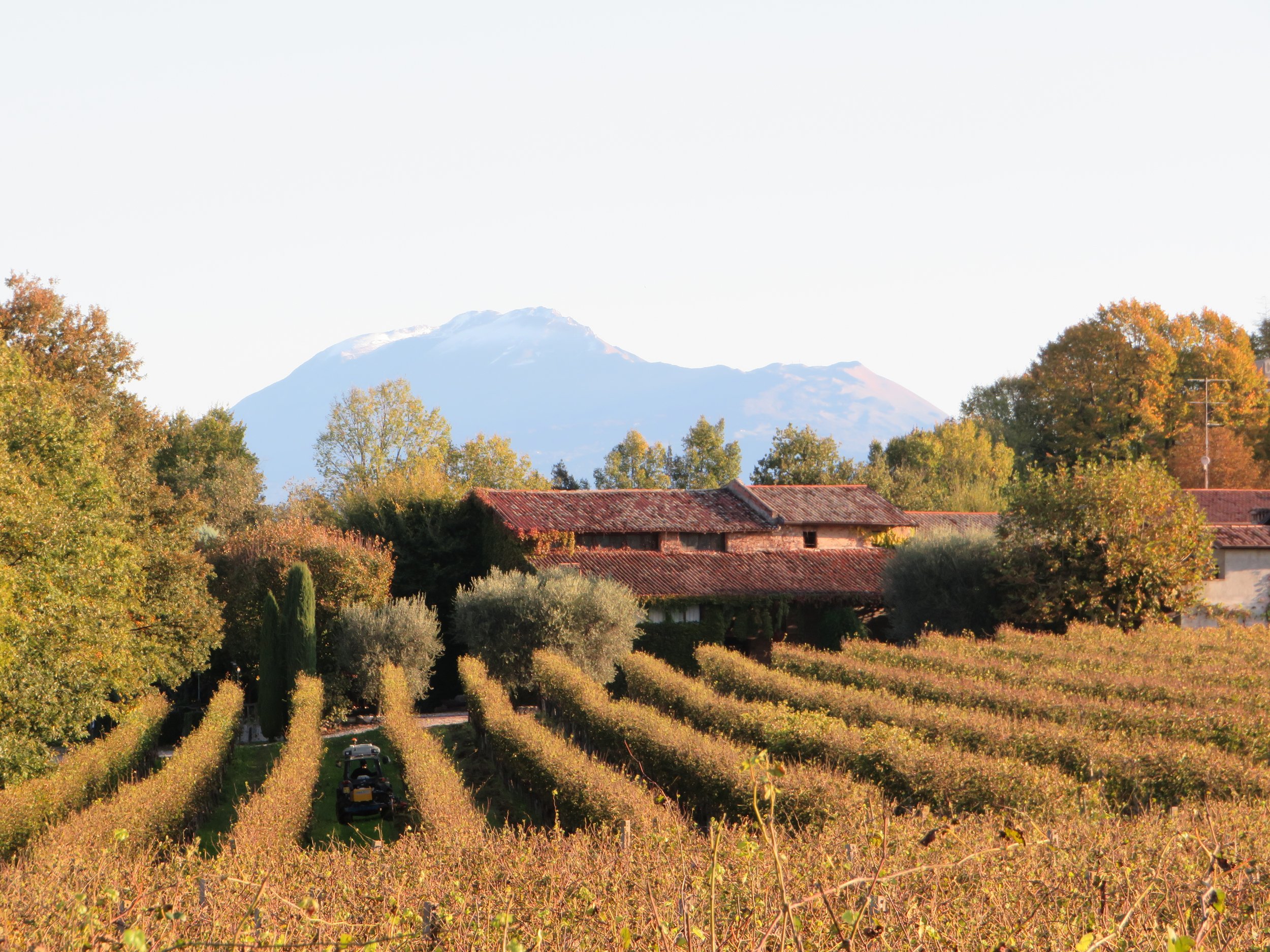
The moraine hills surrounding Desenzano del Garda are among the most authentic landscapes of the Lake Garda region.
Winding roads, vineyards, cypress trees, and panoramic views create the perfect setting for hiking and cycling. One of the best-known routes is the Ciclovia del Sole which runs from Peschiera del Garda to Mantua.
At Selva Capuzza, we organise guided cycling tours with experienced local guides, often combined with hands-on cooking classes celebrating regional cuisine. These relaxed, family-friendly experiences naturally include our award-winning wines, together with a tasting of an older vintage. While our wines are enjoyable when young, bottle ageing allows them to develop remarkable complexity and character.
Browse our events calendar or contact us to create a personalised experience.
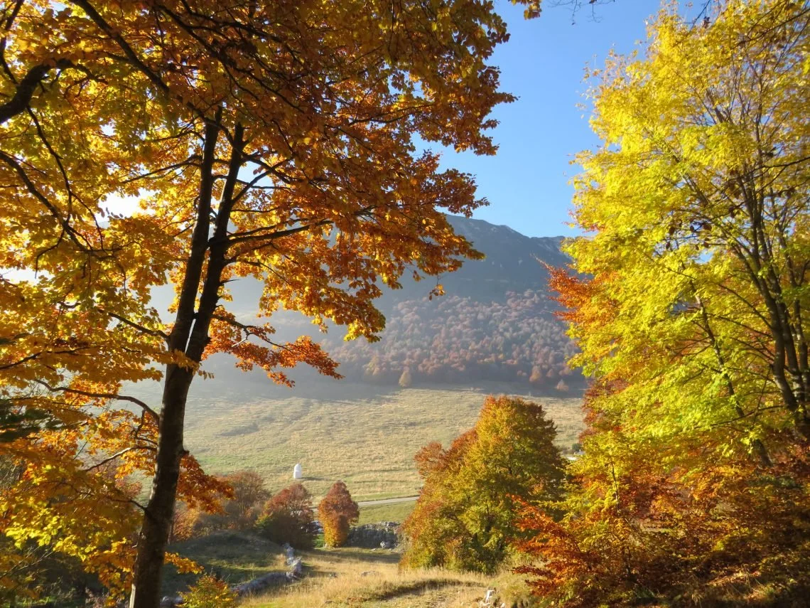
If you enjoy hiking, Monte Baldo is an excellent autumn destination. Its spectacular foliage and sweeping views over Lake Garda make every walk unforgettable. You can reach the summit via the charming Prada–Costabella chairlift or follow an easy hiking trail that takes around two hours. We'd be delighted to help you plan your excursion and recommend the best route.
Autumn offers ideal temperatures for outdoor activities, making every walk or bike ride especially enjoyable. It's also the perfect season to stop for photographs or linger over lunch in a traditional local trattoria.
The View That Will Surprise You
There is one place we recommend to every guest, even those staying for just a weekend.
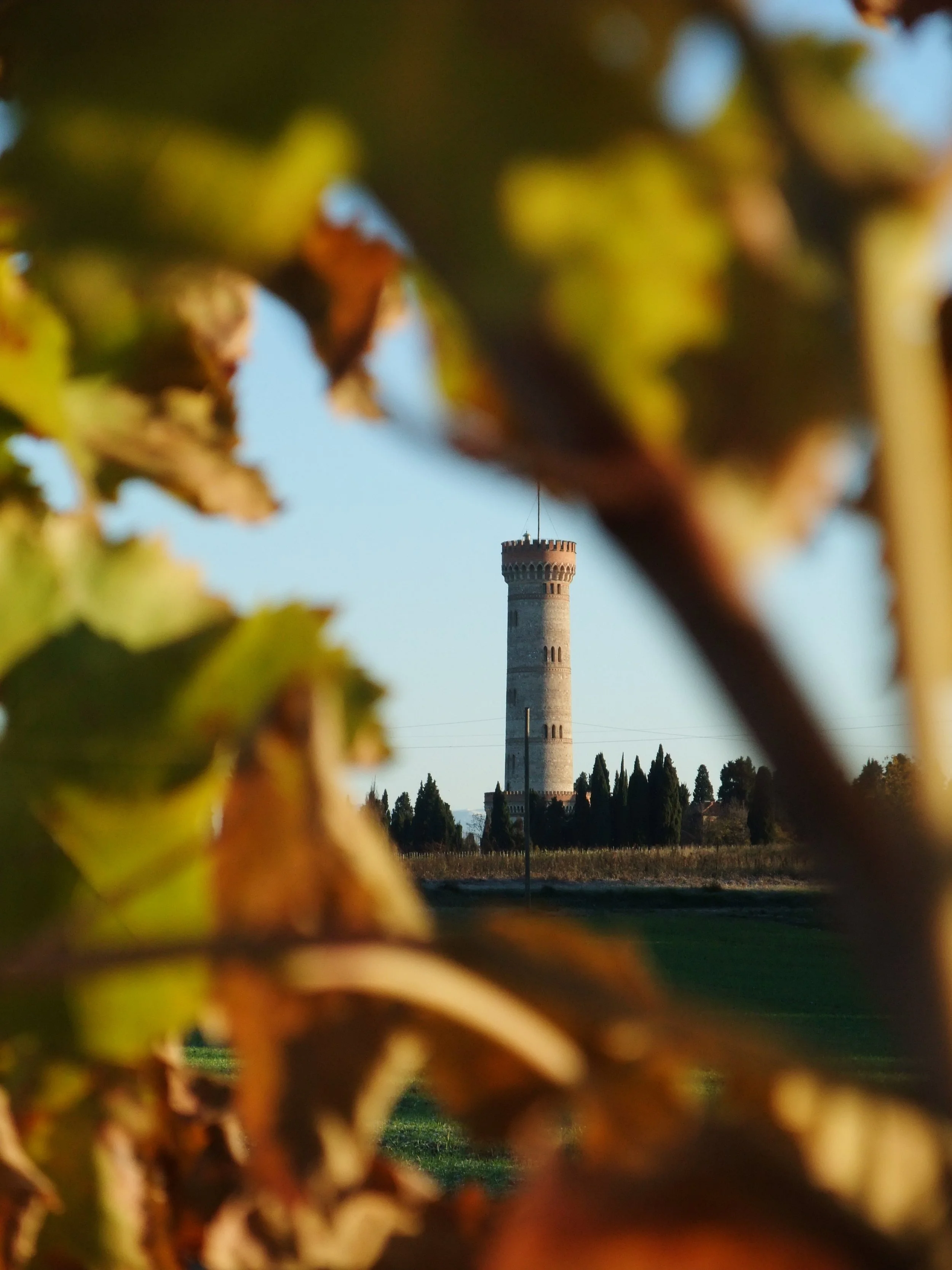
The Tower of San Martino della Battaglia is only a few minutes from our estate and remains one of the area's hidden gems. Visitors often arrive because of its connection to the Italian Risorgimento, but they stay for the breathtaking panorama.
From the top, you'll enjoy sweeping views across Lake Garda, the surrounding mountains, the vineyard-covered moraine hills, and the peaceful countryside stretching into the distance. In autumn, the colours make the scenery even more striking.
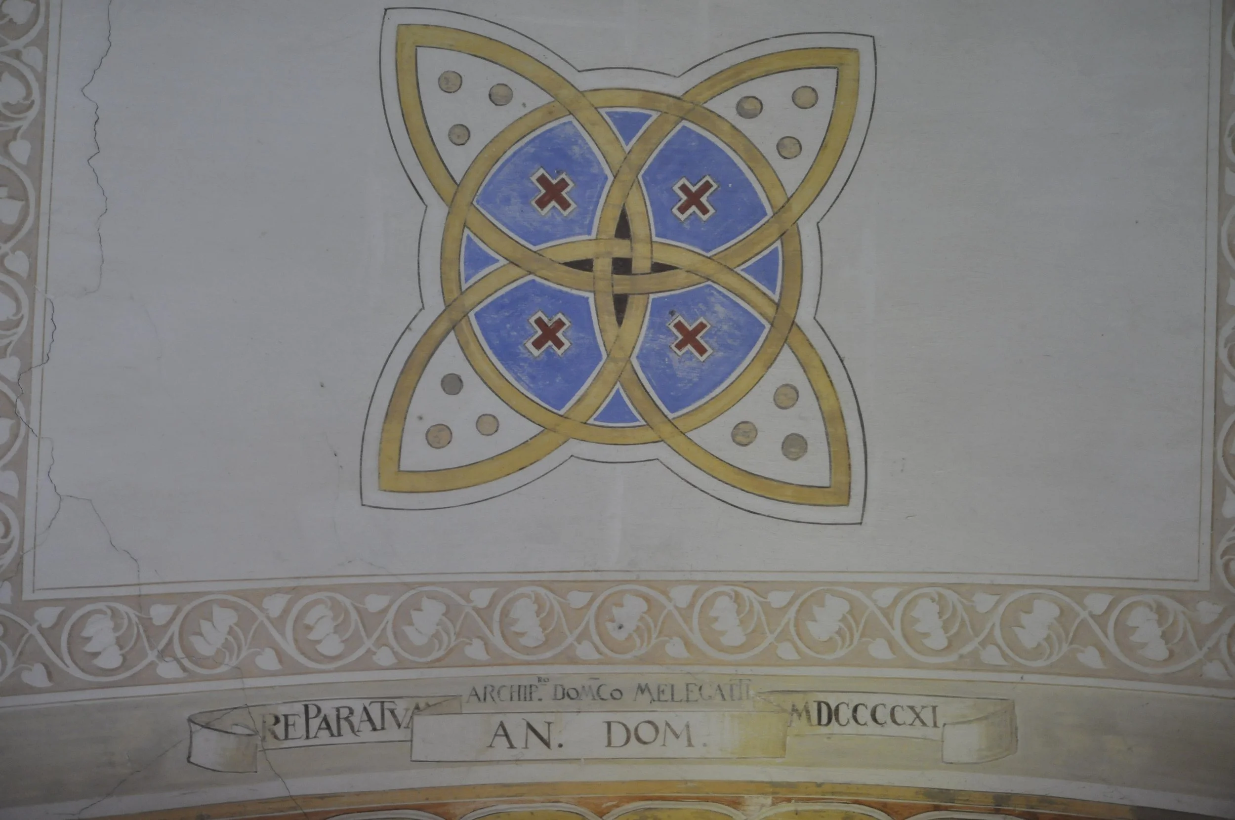
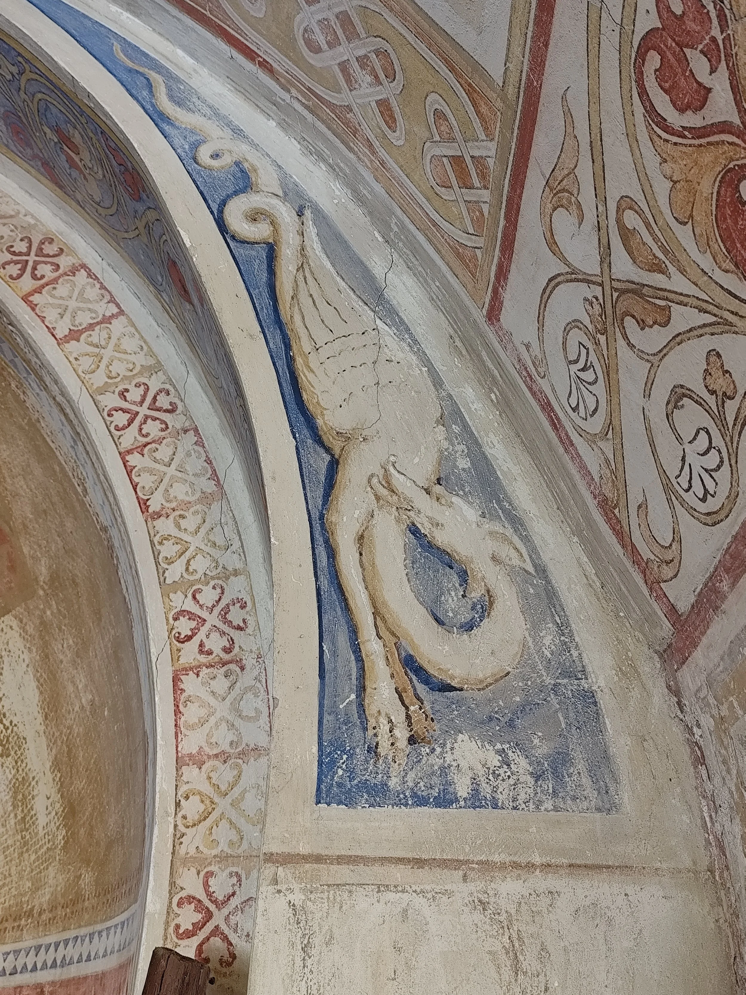
The climb itself is well worth taking slowly. The staircase is lined with impressive frescoes depicting the Battle of San Martino, creating an immersive historical experience.
Did you know that the idea behind the Red Cross was born here? If not, you'll have to visit—we'd be happy to tell you the story.
The Best Time to Visit Lake Garda's Historic Towns
Desenzano, Salò, Sirmione, Peschiera del Garda and Lazise all take on a completely different atmosphere once summer comes to an end.
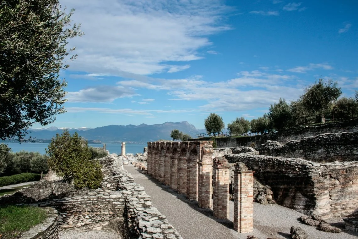
One of our favourite places is the Grotte di Catullo, the impressive remains of a Roman villa at the tip of the Sirmione peninsula. Overlooking the turquoise waters of Lake Garda with the mountains beyond, it is one of the region's most spectacular archaeological sites and an unforgettable place for photography.
A short walk away is Jamaica Beach, where smooth white limestone slabs create crystal-clear pools that often remind visitors of a Caribbean shoreline. It's a wonderful place for a walk in every season.
Autumn is also the ideal time to drive along both the eastern and western Gardesana roads. With lighter traffic, you can stop wherever a view catches your eye.
Don't miss the charming inland villages either, including Borghetto sul Mincio, Solferino and Castellaro Lagusello, or the famous Strada della Forra, described by Winston Churchill as the "eighth wonder of the world."
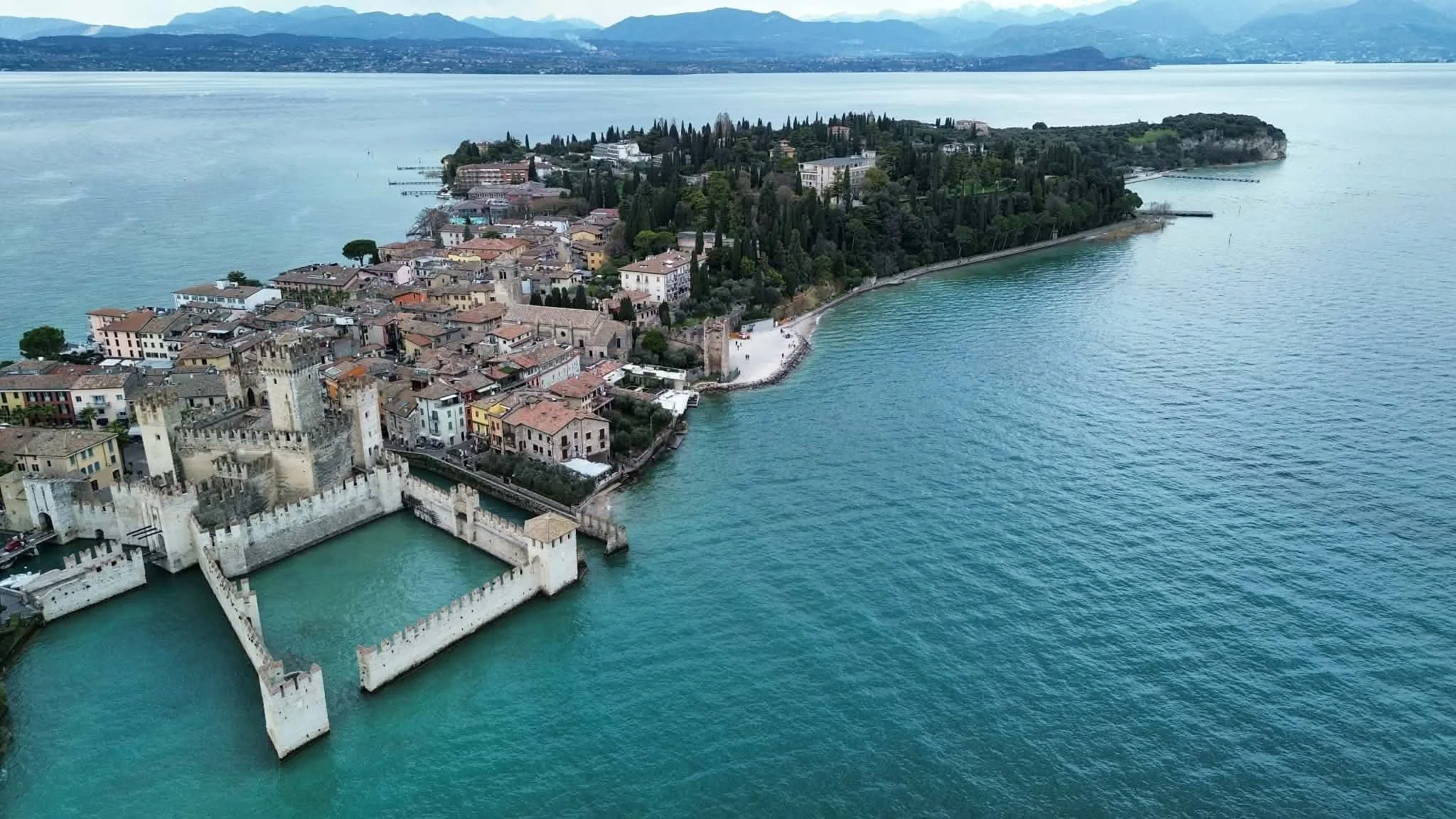
Photo Credit: Jacek Chachurski
The Luxury of Doing Nothing
Many of our guests return after a day of sightseeing and tell us the same thing:
"Tomorrow we're going to slow down."
We couldn't agree more.
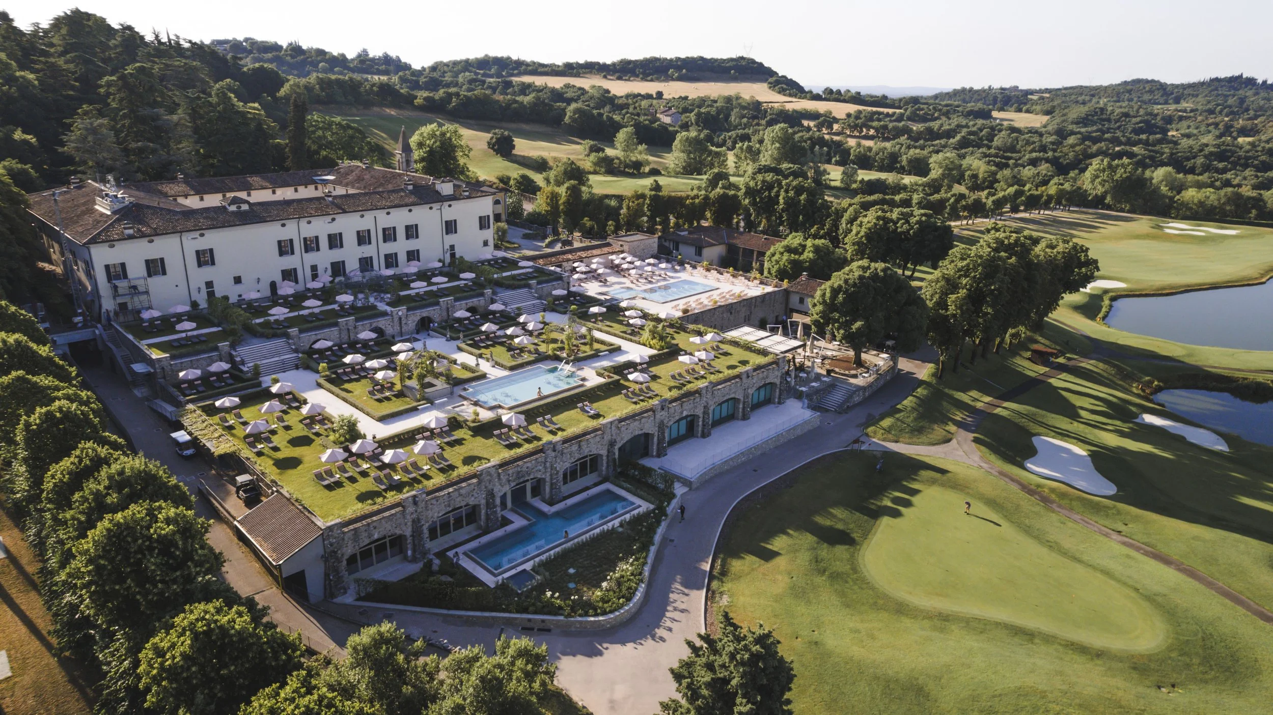
That's why we're pleased to offer our guests a 10% discount at QC Terme Palazzo Arzaga, just twenty minutes from our estate. After a day spent walking, cycling or wine tasting, a few relaxing hours among thermal pools, saunas and wellness facilities are the perfect way to end the day.
Autumn naturally encourages this slower rhythm: taking your time, switching off, and forgetting about schedules.
Seasonal Flavours Around the Table
Dinner is much more than the final meal of the day. It's the moment to relax, share stories, and reflect on everything you've experienced.
At Cascina Capuzza, our cuisine celebrates local ingredients and the changing seasons. Autumn brings mushrooms, pumpkin, truffles, carefully selected meats, our own Garda extra virgin olive oil, and other regional specialities, all thoughtfully paired with wines from our cellar to enhance every flavour.
Autumn at Lake Garda, Our Way
The golden colours of Monte Baldo, vibrant sunsets over the lake, a glass of red wine, and a bike ride through crisp autumn air—this is the Lake Garda we love to share with our guests.
Come and discover a quieter, more authentic side of the region, and you may find that you don't need to travel to the other side of the world to experience something truly extraordinary.